Expertise
About us
Lab Talk: Prof. Dr. Till Nagel – Meandering along the way

Image courtesy of: Harold Fisk, 1944
Describing creative processes, nailing them down or even defining them is difficult and contradictory to their nature. Last Wednesday Prof. Dr. Till Nagel was in our office and explained in his Lab Talk how the principle of meandering has come to symbolize the creative process for him, and that it is not so important whether you make particularly fast or rather slow progress – what really matters is ending up in the ocean.
Till Nagel would have been able to hold many lectures with us, as his résumé, portfolio and references are quite long: He is currently a Professor at the University of Applied Sciences Mannheim, prior to that at the University of Art and Design in Halle; he has lectured in Potsdam and Leuven and conducted research at MIT. His work has been exhibited at the Venice Architecture Biennial, at Design Shanghai and the DMY Festival in Berlin. He is also the author of Processing library Unfolding Maps, which is used in countless projects worldwide.
Although Till is a data visualization expert, it was important for him to show us the big picture, his personal approach: his meandering between technology and design and the resulting approach. Here at Intuity we share the same spirit.
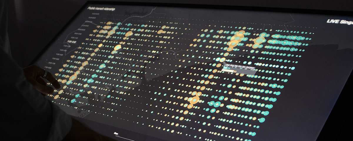
Till works mainly in research and teaching as well as being involved in exhibitions. He grapples with today’s open issues such as mobility and urbanity, for example in the Live Singapore project, which allows citizens to experience their city in a new way digitally thanks to real-time local public transport data. Till and his team from the MIT Senseable City Lab were given access to very precise data from the city of Singapore. However, making practical use of such data, or visualizing it so that connections that were previously invisible become observable in the form of lines, graphs and clusters is an art. Till uncovers these connections in his visual explorations and he continues to study them. In interviews with domain experts, he looks for explanations for unexpected patterns and thus works towards a staging that makes it possible for the broad masses to generate insights and better understand their own environment.
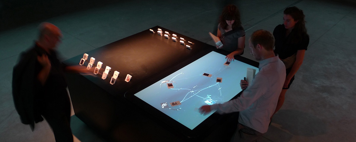
Interesting data visualizations can allow the viewer to perceive relationships that are otherwise reserved for the experts. This is especially evident in the mæve installation exhibited at the Venice Architecture Biennial in 2008. Viewers could place paper cards with printed buildings on a large table, on which additional buildings then appeared with a conceptual reference to the first ones. The installation took up a whole room and several visitors could simultaneously interact and observe the context of the buildings, the era they belong to, the construction techniques that made the building possible, or their style. The architectural cosmos is opened in a playful way and is even made accessible to people who cannot draw on this knowledge base.
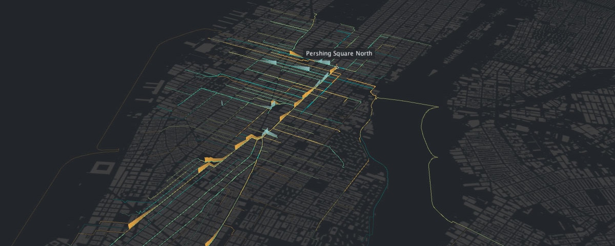
Till Nagel is a researcher; but when he’s finished, he likes to invite his audience, take them by the hand, help them make their own experiences and enable them to leverage the generated knowledge to lead a discussion – especially when it comes to socially important topics or dealing with data per se. He enjoys taking on the challenge of organizing the complexity of the data in such a way that it invites the viewer to get involved with it. From there, it is possible to examine the matter ever more profoundly and to ultimately make new findings. Till and colleagues refer to their method as “staged analysis”: The whole is broken down into its components and processed technically and artistically. This method was put into practice in cf. city flows: Viewers can compare the bike-sharing services offered by London, New York and Berlin, and see where people come from and where they go. The three cities look like vein systems: organic and coalescent. As the timeline approaches 6am, the first points appear on the outer areas. The cities awaken and ever more luminous points make their way toward the centers, which seem to be where the business districts are located. The installation is divided into three views that are classified by their complexity. This makes it very accessible and also allows the viewer to lose his/her way in complex graphs. cf. city flows is many things at once: a city planning information portal, the illustration of a cultural phenomenon, and a digital work of art.
The results of Till Nagel’s work are space-filling installations, but there is always a lot of initial searching to be done. It is only by trying out, experimenting and exploring that he finally finds his starting point and gives shape to a pattern.
He himself sees his works as tools that should be put to use. The data is available to a growing public and should thus also be made accessible to them. Till advocates that this data should not only be used by large corporations, but rather would like to see it democratized, understood and used by the public in a individual manner.
Thank you, Till, for your inspiring talk! We look forward to seeing what the future holds in store.